Topographical Architecture Brings the Printed Contours of Maps to Life
When artificial structures mimic the contours of topographic maps, which are almost sculptural in their own right, they become an extension of the land itself. The lines on the map that indicate changes in elevation, following the curves of dips and projections, easily transform into flat abstracted planes delineating the floors of a building or the levels of a stepped landscape design. Some of these built environments follow the existing shapes of the land beneath them and others create new ones altogether, reimagining the geography of the setting.
This concept model for an art gallery on UC Berkeley’s campus doubles as a bridge spanning Strawberry Creek. The design engages with the topography of the site allowing visitors to either cross or easily access the creek.#conceptmodel #architecture #ucberkeley #strawberrycreek pic.twitter.com/h1KqblfJap
— Jacoby Architects (@JacobyArch) November 17, 2017
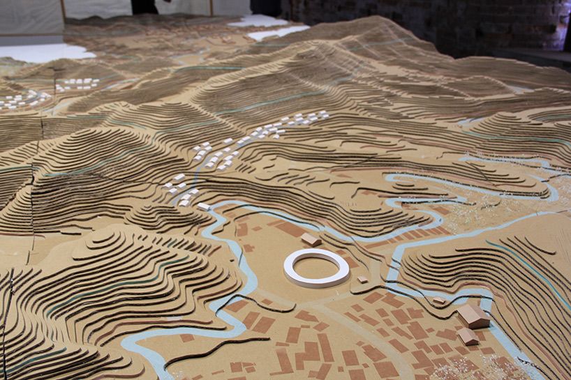
Architects often start with 3D visual models of the terrain of a building site, which may be abstracted into layers of flat wood or foam. These artificial landscapes make it easier to envision how the new structure will fit into its surroundings, and it’s easy to see how they could have an influence on the design of the buildings themselves.
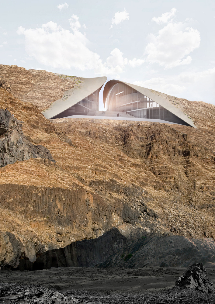
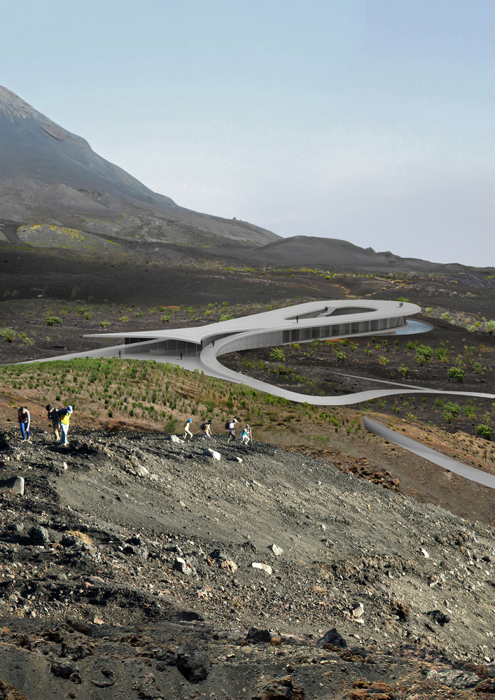
Some topographical architecture is made to blend in, presenting itself almost as if it grew naturally out of the hills that surround it. Krakow University student Adrian Kasperski designed a new natural park venue for the Island of Fogo after its previous one was destroyed by molten lava just a year after its opening, and he used the topography of the land as a guide to avoid similar catastrophes in the future and help camouflage the low-rise facility. It presents itself as a “slight cut in the caldera” with elongated plaza frames that dip down to follow the slopes.
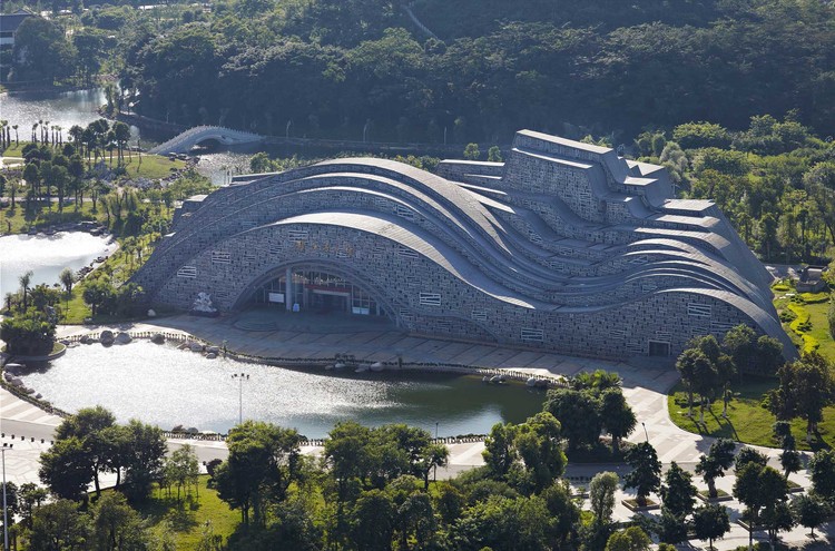
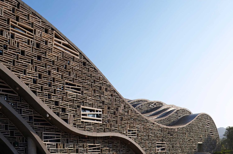
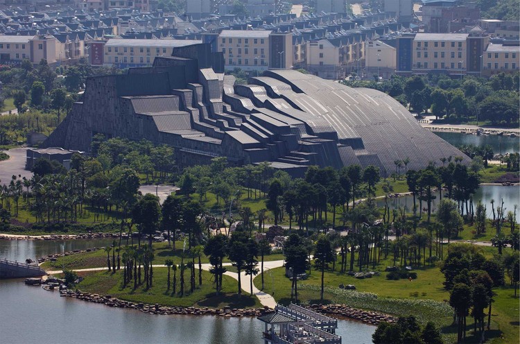
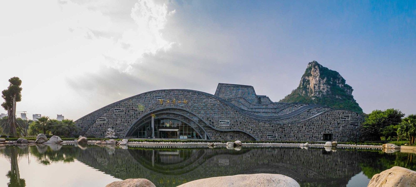
In the Guangxi province of China, the new Suiseki Hall by Zhanghua Architects is as fluid as the body of water beside it, suggesting the shape of hills, yet there are no hills nearby. The architects actually wanted to represent a balance between the flat land and the craggy mountains, taking inspiration from the pattern of stone as it erodes beneath fast-flowing water.
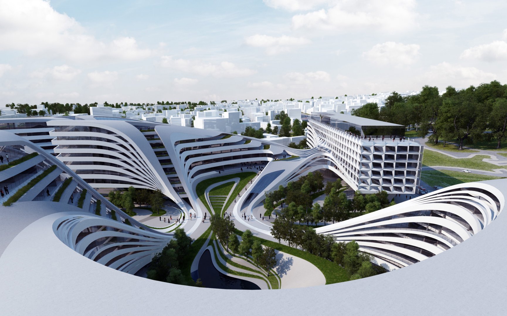
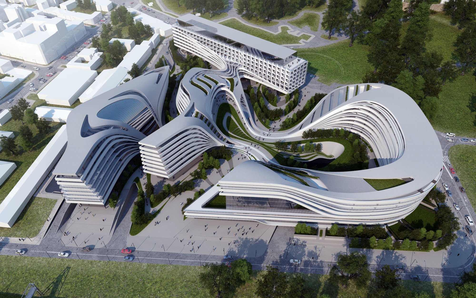
Zaha Hadid Architects’ predilection for flowing organic shapes and parametric modeling naturally lends itself to topographical compositions, like the Beko Masterplan in Belgrade. Paying tribute to the region’s modernist traditions, this proposal embeds a new community into the surrounding mountains. Intriguingly, the flowing volumes seem to have been plucked and stretched right out of the more conventional building beside them, each of their floors like a rocky stratification.
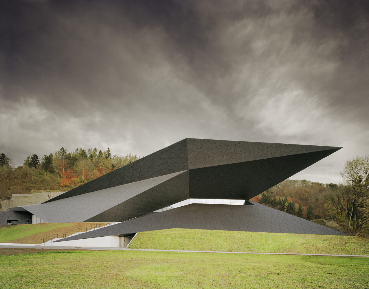
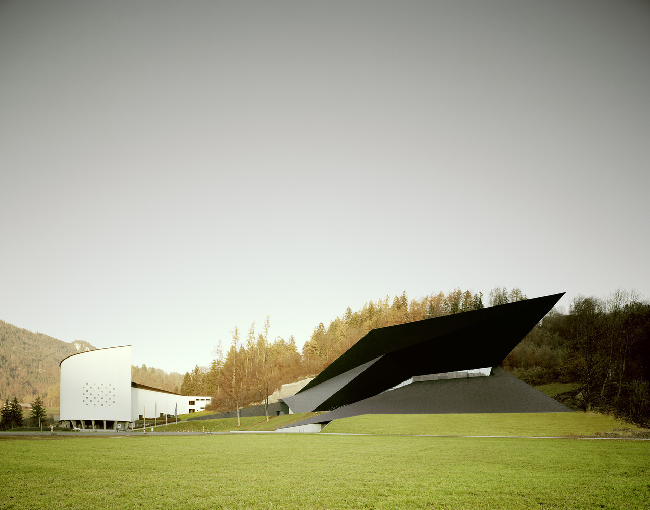
In other cases, dramatic peaks project out of the ground like shards of stone, conjuring a mountain-like sense of solidity. Graphic structures like the Festival Hall in Era by Delugan Meissl Associated Architects take the shapes of natural landscape features and turn them into oversized inhabitable sculptures. The Festival Hall “developed from the topographical conditions, placing it in an adequate relationship with the existing Passionsspielhaus,” the architects explain. It works to achieve a harmony between itself and the existing historical building beside it as well as the mountains in the distance.
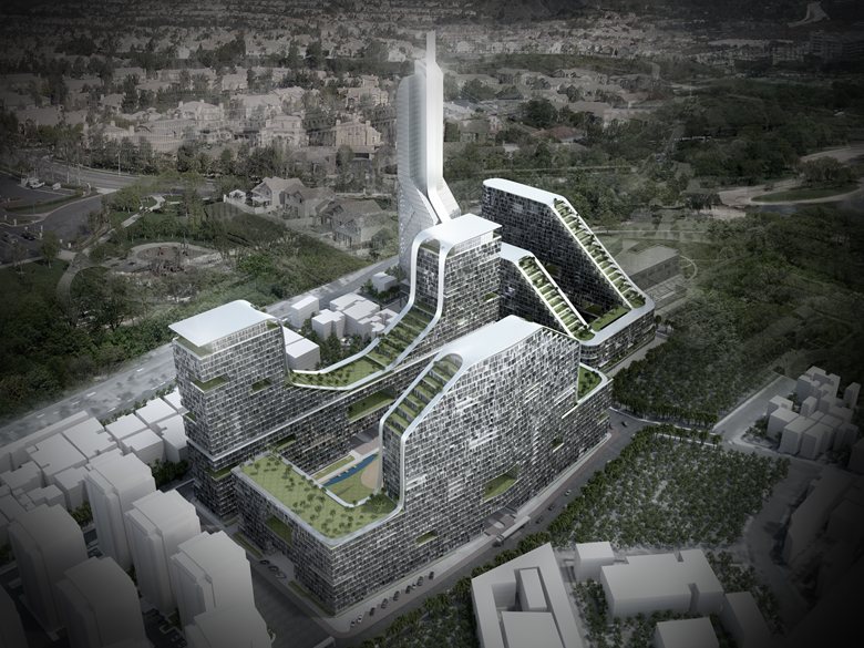
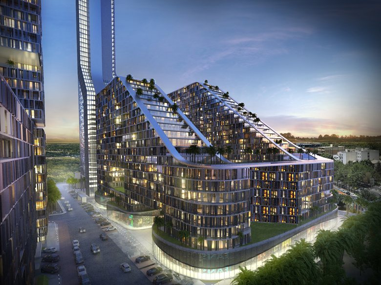
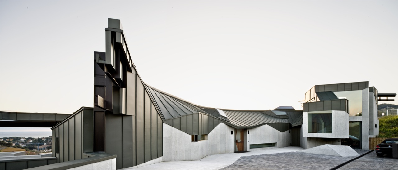
Projects like BC Prestige by 4M Architecture aim to create mountains where there are none, yet their silhouettes aren’t exactly natural, almost seeming like someone took a topographic map and sliced out some of the higher elevations, plopping them down elsewhere. Similarly, the Topographic House by MiAS Arquitectes is like an artificial crag overlooking the sea.
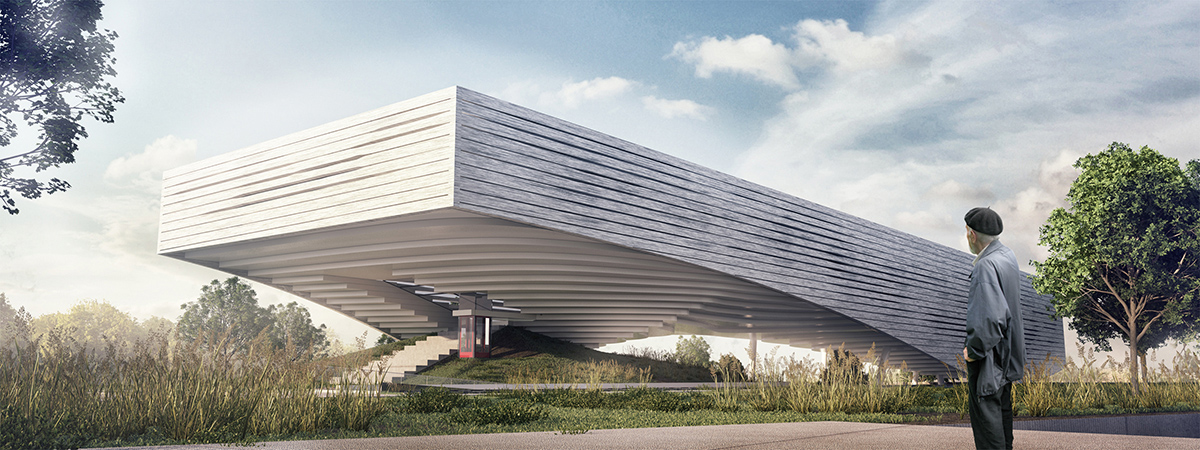
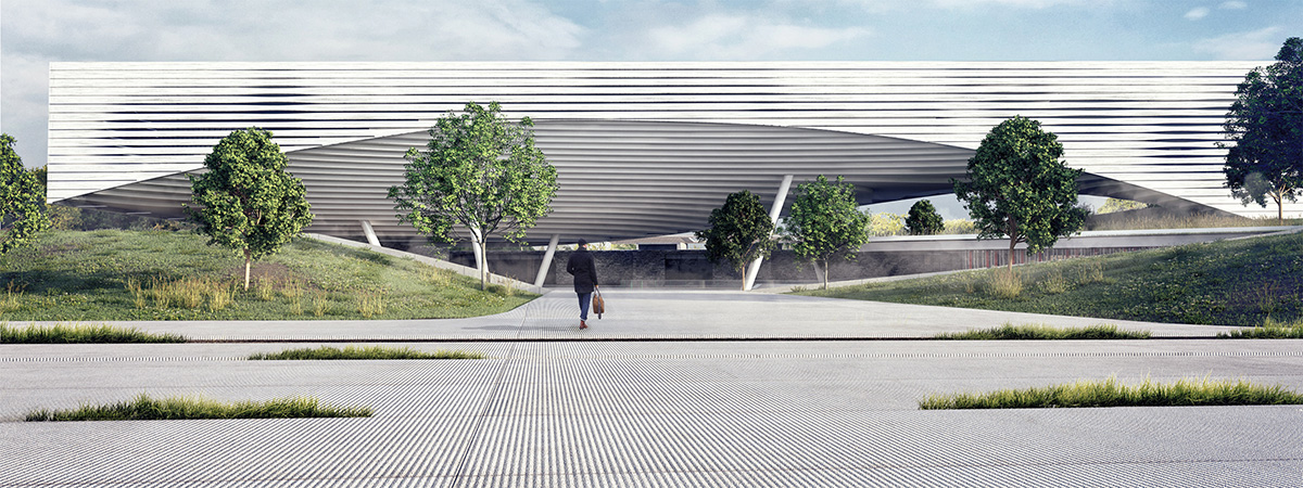
“Rising Over the Traces of History,” a design for a new governmental historic and cultural complex in Kaliningrad by ONZ Architects and Ercan Coban Architects, literally turns this concept upside-down. Its building is flat on top and along the sides, but its underbelly is curved to complement the hills and valleys of the land underneath it.
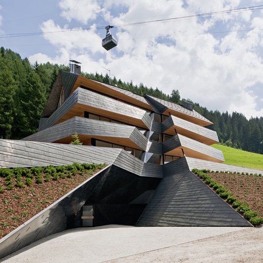
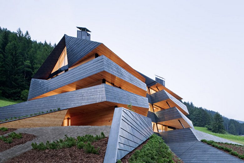
Named for the dramatic Dolomite mountain range in which it’s set, the Dolomitenblick holiday apartment building abstracts the steep slopes, making each shift in elevation into its own level. A diagonal cut offering entrance to the building slices its facade in half, almost as if the “rock” of the structure has been shaped by falling water. “Besides its functional meaning, this incision becomes the main defining element of the building” from the cut at either side a strip unfolds that forms the balustrade of a generous covered balcony and ends into the surrounding topography. Following the steep natural hillside with each floor the strips and the facade jump back,” says Plasma Studio.
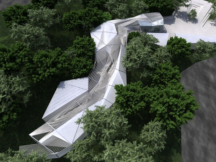
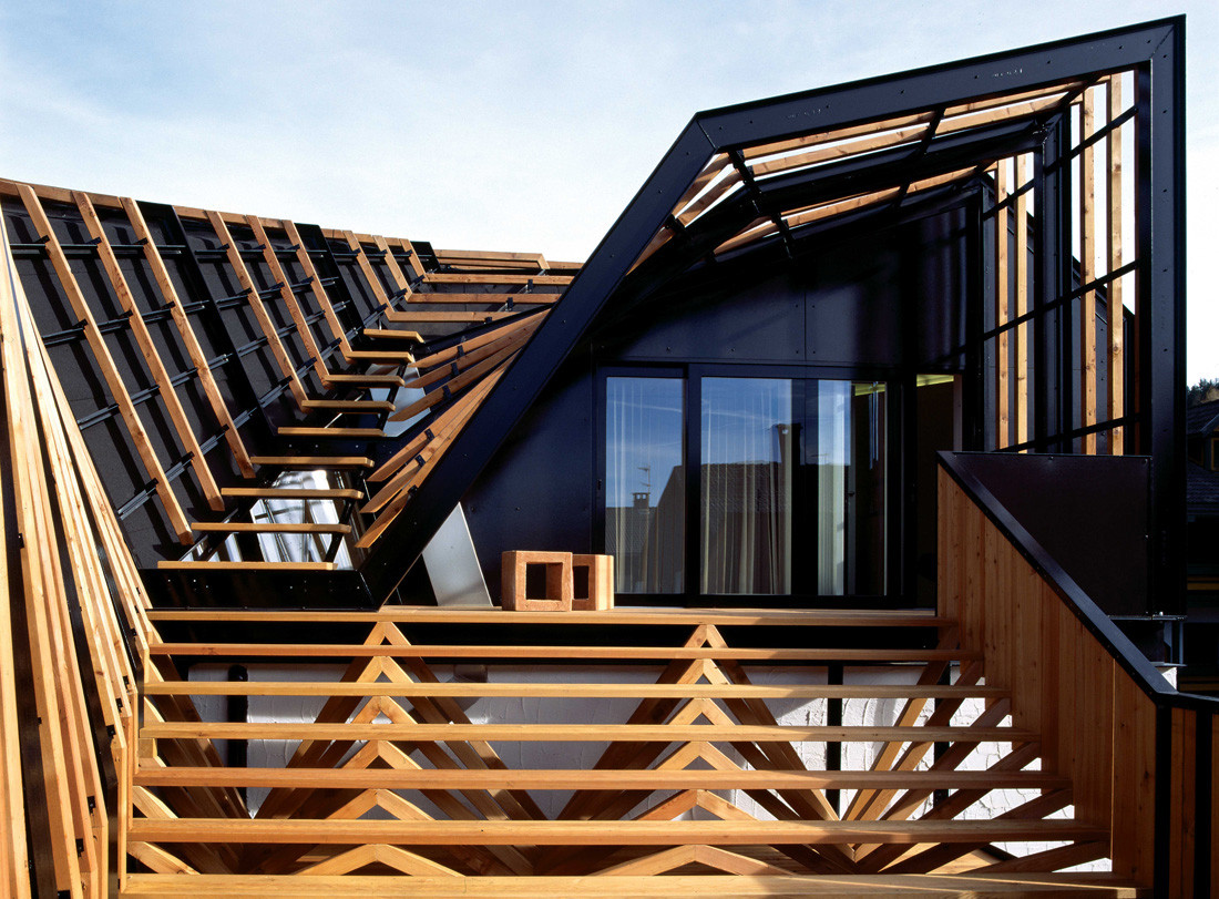
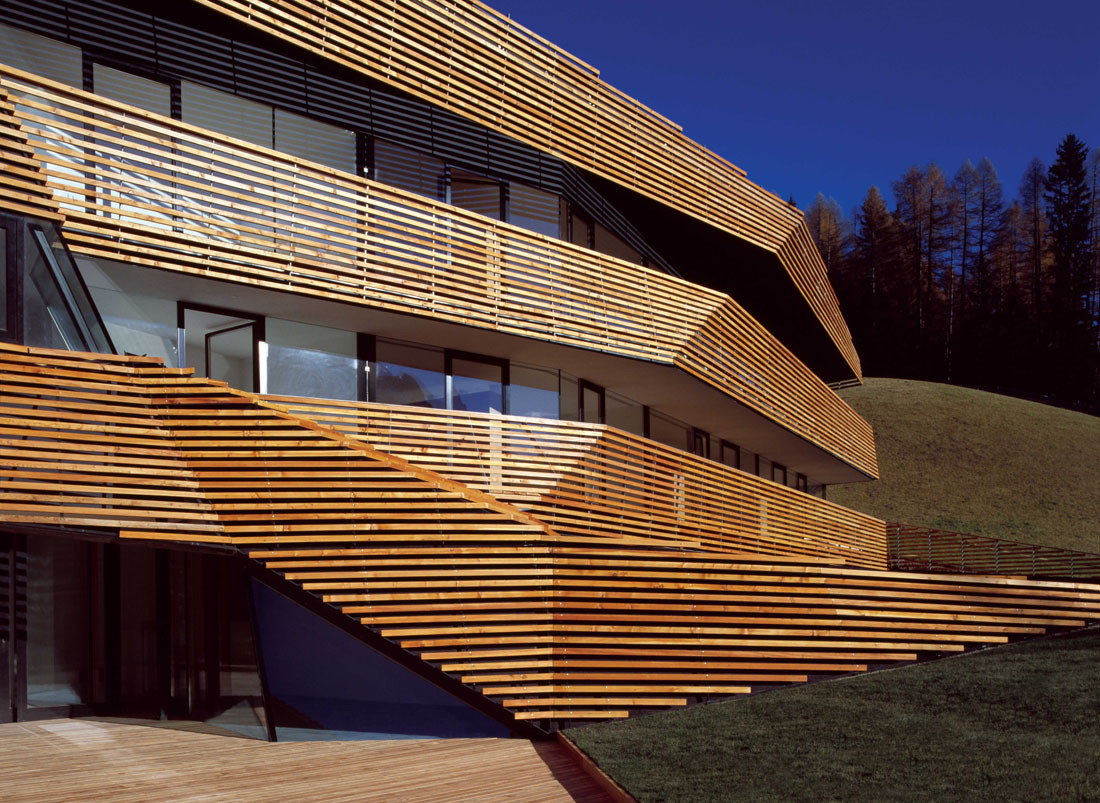
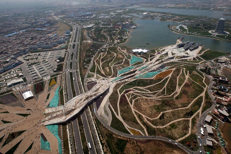
Plasma is well known for “drawing landscapes into buildings,” taking natural shapes and stretching them into more geometric-looking volumes that remain organic nonetheless. This tendency is especially pronounced in projects like its Ggantija World Heritage Park proposal, the dynamic Esker Haus with its slatted timber facade mimicking a “stratified geological formation,” the similar Strata Hotel in Italy “developed as a free-flowing topography” and the Flowing Gardens project developed for the Beijing Olympics, which almost seems to recreate the look of a topographic map when viewed from above. Plasma notes that one of its main strategies is to seamlessly integrate architecture, landscape and urbanism.
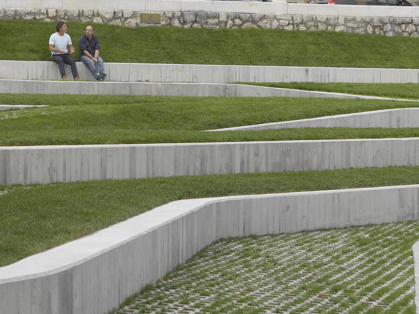
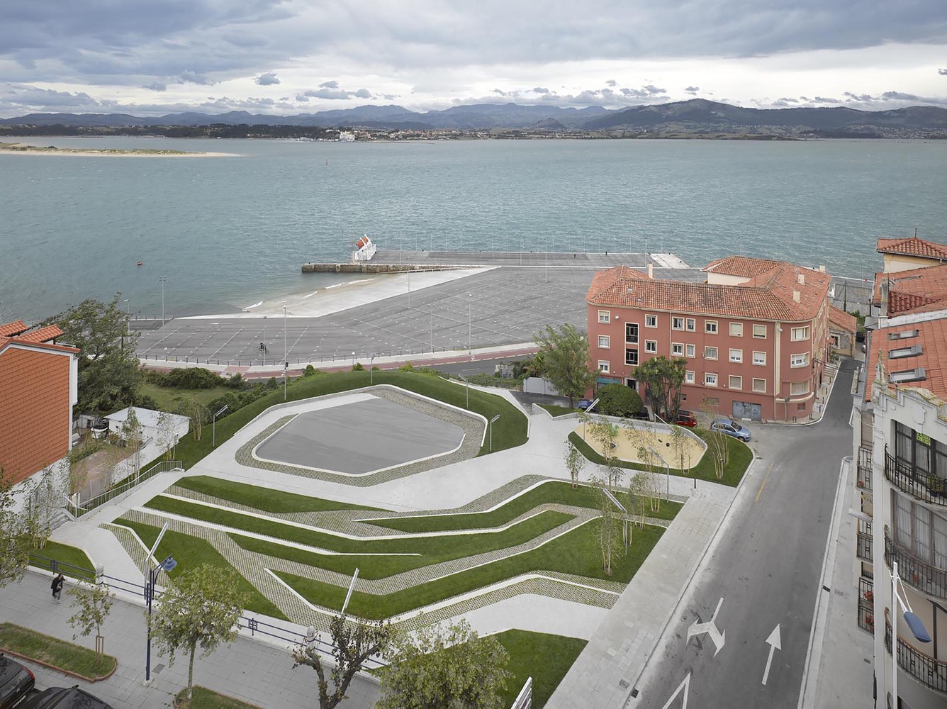
Of course, it’s only natural that topographical design trickles down to landscape architecture as well. Designed with stormwater management in mind, the San Martín de la Mar Square in Cantabria, Spain by the appropriately named Zigzag Arquitectura looks like a topographic map come to life with its series of terraced platforms. The square integrates permeable paving and strips of grass to navigate a steep change in slope and make the overlook at the top more accessible to all.
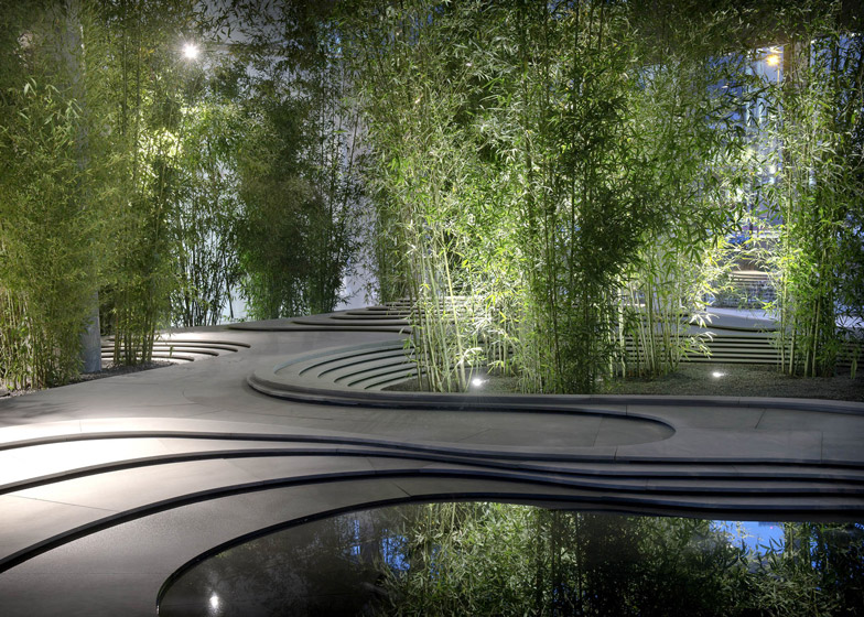
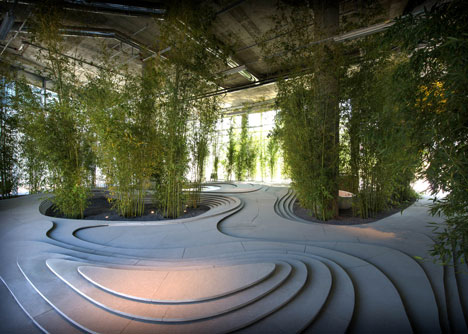
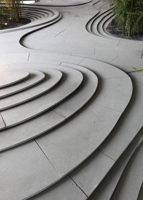
Kengo Kuma’s Naturescape, a topographical landscape of stone and water created for the Urban Stories exhibition of contemporary living in Milan, interprets traditional Zen gardens in a delightfully graphic way. The layers of stone follow curves around the room, creating pathways, clusters of bamboo and pools of water.
http://www.zigzagarquitectura.com/


[ By SA Rogers in Architecture & Cities & Urbanism. ]
[ WebUrbanist | Archives | Galleries | Privacy | TOS ]


