Deciphering Cities: The Secret Languages of Utility Markings, Hobo Codes & Graffiti Tags
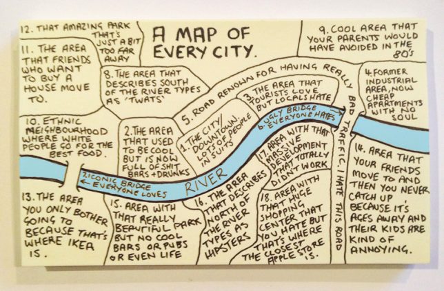
Most cities have so much in common that a generic “map of every city” can seem similarly familiar to people living in London, Paris, New York or another metropolis entirely. General types of neighborhoods aren’t the only things different cities share, though — much less obvious but pervasive are sets of codes, symbols and markings that can communicate meaning across different times and urban spaces.
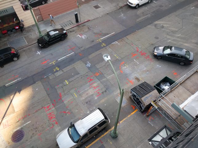
Even though (or perhaps because) people drive over and walk by them every day, it is easy to overlook the rich, colorful and cryptic utility markings spray-painted onto streets and sidewalks. Like graffiti tags or hobo codes, this language of scribbled text, dots, lines and arrows may seem indecipherable at first, but lives depend on engineers, city workers and utility companies understanding what they mean.
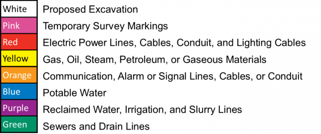
Utility markings tell excavators working on subsurface projects where to dig and (more importantly) where not to dig. A vocabulary of symbols (with its associated grammar of colors) helps diggers steer clear of dangerous power, sewer and water lines as well as other pipes and cables.
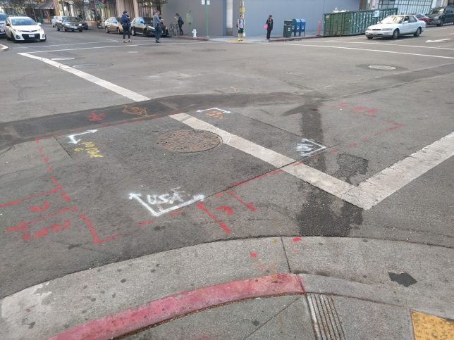
Like any language, utility codes have evolved what one could call regional “accents” of a sort — linguistic conventions that vary from one state or country to the next. Standardization, though, is important in helping keep people safe, which is why there are often local or national rules governing what different colors and symbols represent.
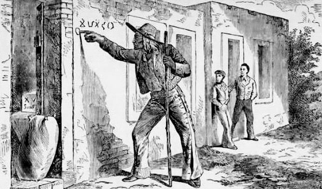
Long before cities came around to the idea of utility markings, train-hopping nomads were working out similarly symbol-based systems of communication. As these travelers roamed America looking for work, particularly during the Great Depression, they learned to leave messages for one another — so-called “hobo codes.” These relatively simple symbols could help fellow travelers find good places to camp and kind people who might give them meals, for instance.
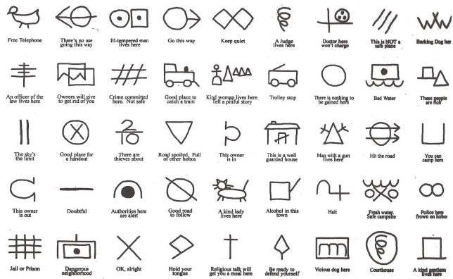
At the time, being nomadic was a mixed bag — some travelers were known as bums or tramps, disparaged for drinking or idling rather than working. The term hobo, though, was more specifically applied to those actively seeking work and willing to take on jobs others didn’t want to do — hobos were met with various degrees of caution and generosity. Many were illiterate, however, so coded symbols with intuitive meanings helped them convey messages through etched or chalked markings. The relatively discreet size and abstract shapes made these marks easy for people not in the know to overlook.
Some symbols represented fairly specific suggestions about how to behave and what to avoid. A cross, for instance, could indicate that talking about religion might help a person get free food from a particular resident. Other markings might caution hobos about heightened crackdowns on vagrants and beggars by local police. While train-jumping culture has changed, some modern travelers have attempted to digitize the idea of hobo symbols through QR codes.

Mural and graffiti art sit somewhere between officially sanctioned and illicit urban communication, depending on the location and surface being tagged. These interventions, too, have evolved a lot over the years. Definitions and genres have sprung up along the way, helpful for tracking and analyzing but also understanding different works — there are pieces, tags, stickers (or: slaps), throw-ups, stencils, heavens, blockbusters, wildstyles and more.
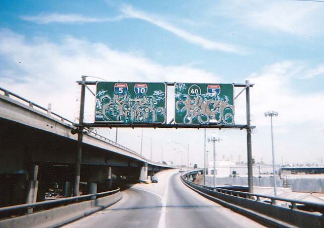
A piece, for instance (short for “masterpiece”) and is usually a complex and multicolored affair difficult to do illegally given the time they take to make. A blockbuster can go either way, often made using rollers and designed to cover up a surface — sometimes one that has already been tagged. A heaven, however, is generally illegal, defined by the difficulty of putting a work up high on something like the back (or front) of a highway sign or the surface of a billboard advertisement — not generally places where one can get official approval to paint.
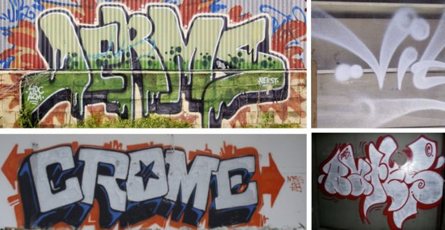
Some typologies are pretty self-explanatory, like bubble letters or fat caps, the latter of which are usually done with wide spray tips, making them both easy to deploy and easy to read (in turn rendering them useful for get-in-and-out-quickly situations). Shadow letters can also take a bit more work, but help a tag pop off a surface, giving it a somewhat more weighty and three-dimensional appearance. Indirectly, the forms and shapes of letters and symbols tell the observer something about the artist’s intent and constraints. Graffiti can even be broken down into characters, alphabets and fonts, which an informed onlooker can use to better understand a given work.
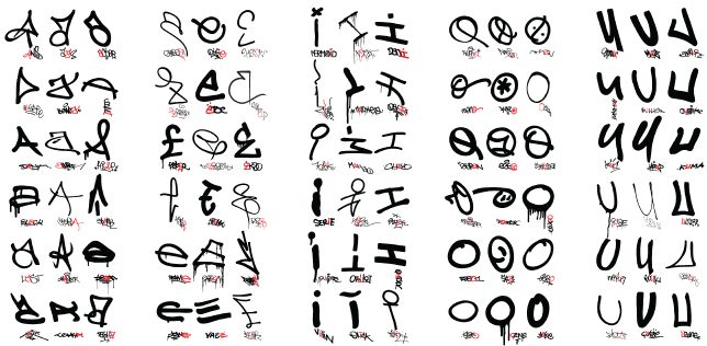

Some artists and art fans have gone to great lengths to classify different types of graffiti, but such a task is destined to be forever incomplete — graffiti is personal and location-specific, not based on any shared font or type. But some, like artist Evan Roth, try anyway to collect, identify and compare examples of letters, creating order out of the seeming chaos of conflicting tags. He also took his project full circle by pasting up alphabets along the city blocks in which they were originally found, encouraging people to look at tags in a new light, offering temporary glimpses into the linguistic ties that bind them loosely together. With any street communication, legal or illegal, there will always be some give and take between fluid creativity and efforts to categorize, standardize and simply understand.


[ By WebUrbanist in Art & Street Art & Graffiti. ]
[ WebUrbanist | Archives | Galleries | Privacy | TOS ]


